CSS Layout Position
- position 속성은 요소에 사용되는 위치를 지정한다.
Position 속성
- 아래와 같은 position 요소에 사용되는 위치 유형 값이 있다.
- static
- relative
- fixed
- absolute
- sticky
- 지정한 다음 위쪽, 아래쪽, 왼쪽 및 오른쪽 속성을 사용하여 위치를 지정한다.
- position 속성을 먼저 설정하지 않으면 작동하지 않는다.
- 또한, 위치 값에 따라 다르게 작동된다.
position:static
- HTML 요소는 기본적으로 static으로 배치된다.
- static 위치 요소는 위쪽, 아래쪽, 왼쪽 및 오른쪽 속성의 영향을 받지 않는다.
- 항상 페이지의 일반적인 흐름에 따라 위치가 지정된다.
position:static 실습 예제 - css_position_static.html
<!DOCTYPE html>
<html lang="en">
<head>
    <meta charset="UTF-8">
    <meta name="viewport" content="width=device-width, initial-scale=1.0">
    <title>Document</title>
    <style>
        div.static {
            position: static;
        }
    </style>
</head>
<body>
<h2>position: static;</h2>
<p>An element with position: static; is not positioned in any special way;
it is always positioned according to the normal flow of the page:</p>
<div class="static">
This div element has position: static;
</div>
</body>
</html>
position: static;
An element with position: static; is not positioned in any special way; it is always positioned according to the normal flow of the page:
position:relative
- 일반 위치를 기준으로 위치가 지정된다.
- 상대적으로 배치된 요소의 위쪽, 아래쪽, 왼쪽 및 오른쪽 속성을 설정하면 해당 요소가 일반 위치를 벗어나 조정된다.
- 다른 콘텐츠는 요소에 의해 남겨진 간격에 맞게 조정되지 않는다.
position:relative 실습 예제 - css_position_relative.html
<!DOCTYPE html>
<html lang="en">
<head>
    <meta charset="UTF-8">
    <meta name="viewport" content="width=device-width, initial-scale=1.0">
    <title>Document</title>
    <style>
        div.relative {
            position: relative;
            left: 30px;
            top: 50px;
            border: 3px solid #73AD21;
        }
    </style>
</head>
<body>
<h2>position: relative;</h2>
<p>An element with position: static; is not positioned in any special way;
it is always positioned according to the normal flow of the page:</p>
<!-- 기준 : 원래 표시되는 위치에서 left, top 이 적용됨-->
<div class="relative">
This div element has position: relative;
</div>
</body>
</html>
position: relative;
An element with position: static; is not positioned in any special way; it is always positioned according to the normal flow of the page:
position:fixed
- 뷰 포트를 기준으로 배치된다. 즉, 페이지를 스크롤 해도 항상 같은 위치에 유지된다.
- 위쪽, 아래쪽, 왼쪽 및 오른쪽 속성은 요소의 위치를 지정하기 위해 사용된다.
- fixed 요소는 일반적으로 위치했던 페이지에 공백을 남기지 않는다.
position:fixed 실습 예제 - css_position_fixed.html
<!DOCTYPE html>
<html lang="en">
<head>
    <meta charset="UTF-8">
    <meta name="viewport" content="width=device-width, initial-scale=1.0">
    <title>Document</title>
    <style>
        div.fixed {
            position: fixed;
            bottom: 0;
            right: 0;
            width: 300px;
            border: 3px solid #73AD21;
        }
    </style>
</head>
<body>
<h2>position: fixed;</h2>
<p>An element with position: static; is not positioned in any special way;
it is always positioned according to the normal flow of the page:</p>
<div class="fixed">
This div element has position: fixed;
</div>
</body>
</html>
position: fixed;
An element with position: static; is not positioned in any special way; it is always positioned according to the normal flow of the page:
position:absolute
- absolute는 고정처럼 뷰포트를 기준으로 배치하는 대신 가장 가까운 위치의 부모 요소를 기준으로 배치된다.
- 하지만, absolute position이 position 요소가 없으면 문서 본문을 사용하고 페이지 스크롤과 함께 이동한다.
- absolute는 일반 흐름에서 제거되며 요소가 겹칠 수 있다.
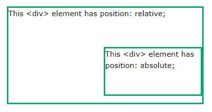
position:absolute 실습 예제 - css_position_absolute.html
<!DOCTYPE html>
<html lang="en">
<head>
    <meta charset="UTF-8">
    <meta name="viewport" content="width=device-width, initial-scale=1.0">
    <title>Document</title>
    <style>
        div.relative {
            position: relative;
            width: 400px;
            height: 200px;
            border: 3px solid #73AD21;
        }

        div.absolute {
            position: absolute;
            top: 80px;
            right: 0;
            width: 200px;
            height: 100px;
            border: 3px solid #73AD21;
        }
    </style>
</head>
<body>
<h2>position: absolute;</h2>
<p>An element with position: absolute; is positioned relative to the nearest positioned ancestor
(instead of positioned relative to the viewport, like fixed):</p>

<!--
    자식 div태그가 position:absolute 명령어를 사용하면 기준이 되는 태그는
    부모 div태그가 position:relative 기능이 적용되어 있으면, 기준이 부모 div태그가 되고
    position:relative 기능이 적용되어 있지 않으면, body태그가 기준이 된다.
    position:absolute와 top:80px, right:0 의 좌표가 결정된다.
-->

<div class="relative">This div element has position: relative;
    <div class="absolute">This div element has position: absolute;</div>
</div>
</body>
</html>
position:sticky
- 사용자의 스크롤 위치를 기준으로 배치된다.
- 스크롤 위치에 따라 relative 및 를 전환한다.
- fixed 뷰포트에서 주어진 오프셋 위치가 충족될 때까지 상대적인 위치에 배치된다. 그런 다음에 고정된다.
position:sticky 실습 예제
<!DOCTYPE html>
<html>
<head>
<style>
div.sticky {
  position: -webkit-sticky;
  position: sticky;
  top: 0;
  padding: 5px;
  background-color: #cae8ca;
  border: 2px solid #4CAF50;
}
</style>
</head>
<body>

<p>Try to <b>scroll</b> inside this frame to understand how sticky positioning works.</p>

<div class="sticky">I am sticky!</div>

<div style="padding-bottom:2000px">
  <p>In this example, the sticky element sticks to the top of the page (top: 0), when you reach its scroll position.</p>
  <p>Scroll back up to remove the stickyness.</p>
  <p>Some text to enable scrolling.. Lorem ipsum dolor sit amet, illum definitiones no quo, maluisset concludaturque et eum, altera fabulas ut quo. Atqui causae gloriatur ius te, id agam omnis evertitur eum. Affert laboramus repudiandae nec et. Inciderint efficiantur his ad. Eum no molestiae voluptatibus.</p>
  <p>Some text to enable scrolling.. Lorem ipsum dolor sit amet, illum definitiones no quo, maluisset concludaturque et eum, altera fabulas ut quo. Atqui causae gloriatur ius te, id agam omnis evertitur eum. Affert laboramus repudiandae nec et. Inciderint efficiantur his ad. Eum no molestiae voluptatibus.</p>
</div>

</body>
</html>
'Devlopment > HTML & CSS' 카테고리의 다른 글
| [CSS] Layout 실습 코드 (1) | 2024.01.07 |
|---|---|
| [CSS] Layout Float (0) | 2024.01.07 |
| [CSS] 레이아웃 속성 - Layout Display (0) | 2024.01.07 |
| [CSS] 표(Tables) 생성 및 속성 실습 (0) | 2024.01.07 |
| [CSS] 스타일 링크(Style Links) (1) | 2024.01.07 |